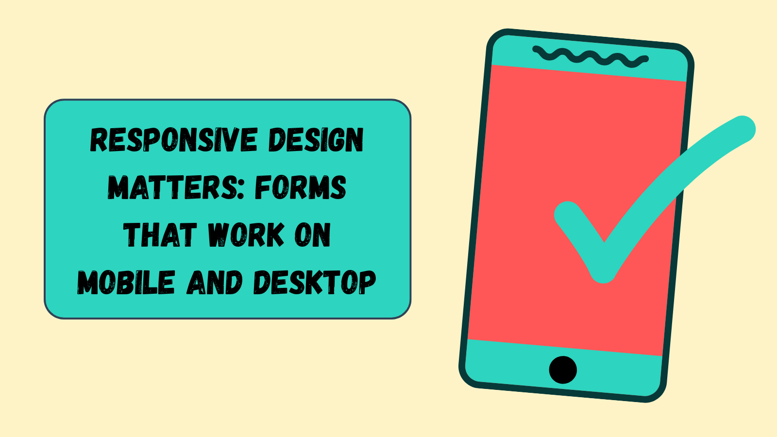
Responsive design matters: forms that work on mobile and desktop
Half your users fill forms on their phones. Here’s how to design feedback forms that look great everywhere — and why it’s easier than you think.
10/27/2025
Responsive design matters: forms that work on mobile and desktop
You’ve spent hours writing smart questions, crafting the perfect flow —
then half your audience bounces because they tried filling it out on a phone that felt like a postage stamp.
Yeah, we’ve seen it too.
In 2025, mobile-first isn’t optional — it’s table stakes.
If your feedback form isn’t responsive, it’s quietly bleeding responses.
Let’s fix that.
Try it yourself: Open the demo form on mobile →
1) The mobile majority
Here’s the reality: most users fill out forms on their phones.
Whether it’s customer feedback, post-purchase surveys, or event check-ins — mobile wins by volume every time.
If your layout breaks, your spacing’s tight, or your inputs feel like a finger trap, people leave.
Responsive design is how you keep them.
What “responsive” really means
It’s not just about shrinking the form — it’s about adapting gracefully:
- Inputs that scale naturally.
- Buttons that are easy to tap.
- Fonts that stay readable without zooming.
- No horizontal scrolling (ever).
2) Why it impacts completion rates
We’ve seen it again and again:
Mobile friction = lower completion = lost insights.
Every time someone pinches, scrolls sideways, or has to retype something, you lose momentum.
When the experience feels effortless, completion rates climb — simple as that.
Data meets design: Our drop-off analytics show that mobile users quit earlier on clunky layouts. Fix the layout, and drop-off drops too.
3) Building responsive forms the easy way
If you’re coding everything from scratch, sure, it’s work.
But if you’re using Survee, it’s automatic.
Here’s how it’s handled:
- Fluid layout: every question scales for mobile and desktop.
- Dynamic spacing: no squished fields or cropped buttons.
- Smart typography: readable on any screen, from iPhone Mini to ultrawide.
- Keyboard-aware inputs: fields stay visible while typing (yes, we thought of that).
You don’t have to “make it responsive.” It already is.
4) How to test your form before you share it
A quick 3-step preflight checklist:
- Preview on real devices.
Don’t rely on browser resizes — open it on your phone. - Check tap targets.
Buttons should feel easy, not delicate. - Run through your flow.
Does it scroll smoothly? Does every question fit naturally on screen?
If the answer’s yes, your users won’t think about the design at all — and that’s the goal.
5) The small-screen advantage
Funny enough, smaller screens force better writing.
You naturally cut fluff and focus on clarity — one question, one purpose.
That’s exactly what conversational forms do:
One question per screen, focused and fast.
When you combine that with a responsive layout, you get the perfect flow — simple, intuitive, and human.
6) Responsive by default — not an afterthought
At Survee, responsive design isn’t a “feature.”
It’s baked in. You focus on asking better questions; we make sure it looks perfect everywhere.
So whether your users are on a 27" monitor or a train at rush hour, your form works beautifully.
See it in action:
Build a responsive form now →
or open the demo form →
Published by Survee — forms that feel human and look great everywhere.